 07 3375 6777
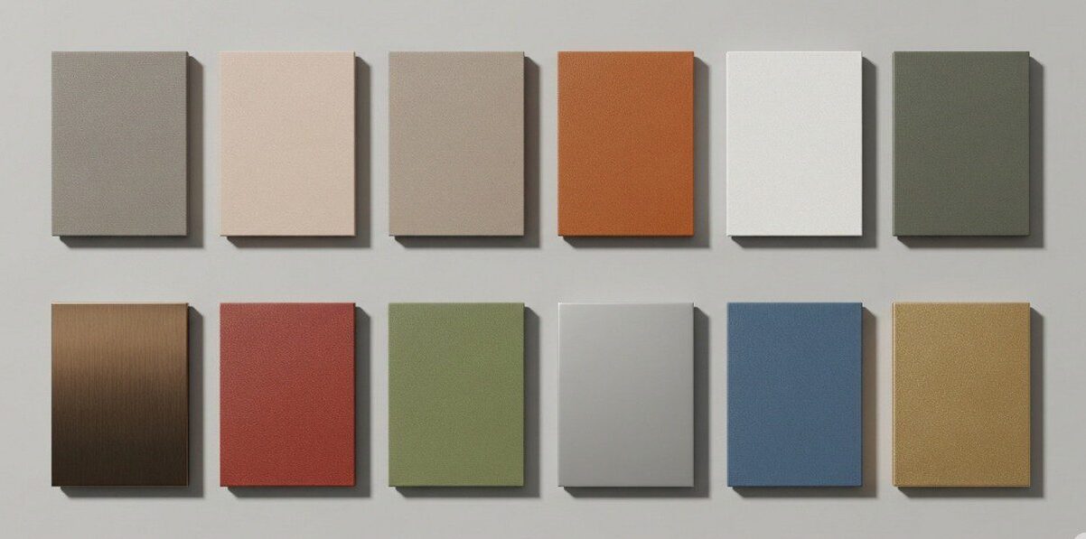
In the world of architecture and design, few elements shape perception and mood as powerfully as colour. At Superior Coaters, we’ve established a reputation rooted in exceptional durability, expert handling of oversized structures, and industrial-grade finishes. Now, we’re branching into the creative and design-centric realm—highlighting how striking colour choices and custom finishes can transform architectural projects into visual masterpieces.
Why Colour & Finish Matter in Architecture
Powder coating isn’t just about protection—it’s a design tool. For architectural applications, the choice of hue, texture, and finish influences not only aesthetics but also mood, branding, and environmental integration. Whether accentuating street furniture, enhancing façade elements, or unifying interior fixtures, the power of powder-coated colour can’t be overstated.
-
Calming Neutrals with Warm Undertones (Dulux “Still” Palette)
According to Dulux’s 2025 Colour Forecast, the “Still” palette embraces warm, grounded neutrals—think soft browns, warm greys, and muted beiges. These colours foster feelings of comfort, nurturing, and understated elegance—ideal for architecture that seeks refinement without bold accents.
Design idea: Imagine urban benches, railings, or balustrades in earthy tones like Duralloy Jasper or Stone Grey. These finishes would pair beautifully with natural materials—think timber accents, stone cladding, or matte-finish brickwork—to create cohesive, tactile environments.
-
Soft Vibrant Contrasts (Dulux “Emerge” Palette)
The “Emerge” palette brings pastel joy into architectural design through soft pinks, biscuit tones, and muted blues—subtle yet energizing. These hues suit creative interiors or feature elements where energy and positivity matter.
Design idea: Use Duralloy Pink Sand or New Life for interior screening, decorative signage, or artistic details. These soft tones impart brightness and character without overwhelming spaces—and cue playful, luminous dialogue with neutral backdrops.
-
Moody Blues & Deep Hues
“Moody blues” like Midnight Navy or Deep Indigo continue to gain traction—bringing sophistication, depth, and timeless elegance. Their dramatic allure adds character to architectural features like balustrades, cladding, or specialty installations.
Design idea: Consider using a deep navy or indigo finish on key metal elements—such as canopy structures, frames, or outdoor furniture—to offer high-impact contrast that holds up beautifully against natural light and weather exposure.
-
Terracotta & Earthy Warmth
Terracotta-inspired tones such as “Terracotta Sunset” are transcending the indoors and entering the architectural palette across Australia—evoking warmth, organic charm, and earthiness in design.
Design idea: Use terracotta finishes on cladding details, fencing, or urban seating to create a grounded, welcoming feel. These earthy shades evoke regional warmth—especially fitting for Queensland environments—and pair naturally with vegetation and natural textures.
-
Colour Drenching for Statement Interiors
A bold trend gaining momentum—especially in residential and boutique commercial spaces—is “colour drenching”, where an entire room is bathed in a single hue (walls, trims, fixtures, and furniture). This immersive effect—particularly in deep burgundy, dark blue, or ochre—creates rich emotional resonance and spatial definition.
Design idea: For feature installations—say, a shopfront alcove, stairwell enclosure, or powder room—choose a single intense powder-coated colour to envelop surfaces. It’s a bold move but one that turns architectural elements into expressive design statements.
Custom Finishes & Textures: Elevating Tactility
Beyond colour, architectural projects can benefit from thoughtful textures and finishes:
- Matte vs Gloss
Matte finishes offer modern subtlety, while gloss adds reflectivity and visual drama. Choosing the right sheen can greatly affect how colour interacts with light. - Metallic & Textured Effects
Metallic powders, anodic finishes, and shimmering textures imbue surfaces with depth and luxury—perfect for focal architectural accents - Colour Matching & RAL Options
Superior Coaters often handles projects with specific architectural colour references. Whether you’re matching RAL codes or Pantone hues, our advanced colour matching ensures precise results. We can also source digital and physical sample swatches for previewing finish behaviours.
Enhancing Brand Identity & Visual Storytelling
Colour isn’t just aesthetic—it’s strategic. From corporate branding to urban wayfinding, powder-coated colour selections can reinforce project messaging and user experience.
- Brand Cohesion
Use brand colours on site elements—signage frames, cabinetry, or street posts—to strengthen visual identity cohesively. - Environmental Integration
Thoughtful colour choices allow structures to blend or stand out as desired—e.g. dark elements integrate into brickwork, or bright tones highlight safety features and directional signage.
Why Superior Coaters Is Your Go-To Partner for Colour & Design
At Superior Coaters, our capabilities stand out in both scale and precision:
- We operate one of Australia’s largest batch-cure ovens, handling pieces up to 14 metres long—a major advantage for architectural projects with oversized components.
- Our facility offers a full range of textures—matte, gloss, metallic, textured—giving designers flexibility to realise their vision.
- With decades of experience and ISO-aligned quality control systems, we ensure colour consistency, adhesion strength, and long-term durability—so your design continues to look great for years.
- We’re deeply familiar with architectural and industrial standards in Australia—and can guide colour and finish selection based on environmental exposure, UV resistance, and maintenance considerations.
Summary: Inspiring Colour Directions for Architectural Impact
|
Trend / Finish |
Mood & Impact |
Suggested Application |
|
Still (Warm Neutrals) |
Calming, grounded |
Benches, railings, façade metal accents |
|
Emerge (Pastels) |
Uplifting, soft |
Interior screens, decorative elements |
|
Moody Blues / Deep Hues |
Elegant, bold |
Feature structures, framing, signage |
|
Terracotta / Earth Tones |
Cozy, organic warmth |
Fences, urban furniture, cladding |
|
Colour Drenching |
Immersive, dramatic |
Feature rooms, powder-coated interiors |
|
Special Finishes (Matte, Metallic) |
Textural sophistication |
Highlight trims, focal architectural details |
Final Thought
Colour isn’t just the final touch—it’s a language. Whether you’re aiming for calming cohesion or bold expressions, powder coating allows architectural projects to speak with texture, tone, and longevity. Superior Coaters is here to help you explore these colour trends, achieve custom finishes, and translate vision into enduring design.
Want help selecting the perfect trend, matching specific tones, or previewing finishes in person? Let’s collaborate—your next architectural colour statement starts here.